learning on the job
Other Posts in This Series
? The ZFs monitoring dashboard is available on grafana.com, and there is a GitHub page for issues and feedback
I’ve been wanting to monitor ZFS latencies, and found Richard Elling’s tool for exporting that data to influxdb. The dashboards for it are written for InfluxDB v1, whereas I run v2. Part 1 goes over setup and data ingress; then Part 2 covered getting to grips with flux to start porting to v2. Part 3 gets into the meat of porting- variables, panels, better heatmaps. Part 4 tidies up by reducing repetition in panels, queries, constants and functions. Part 5 covers publishing and a short reflection/retrospective.
Context
I recently set up telegraf to collect metrics from a host running proxmox using (among other things) zpool_influxdb. Data is good, but well-visualised data is better. The repo for zpool_influxdb has grafana dashboards, and there is a published dashboard by Scott MacDonald over at grafana labs that looks good:
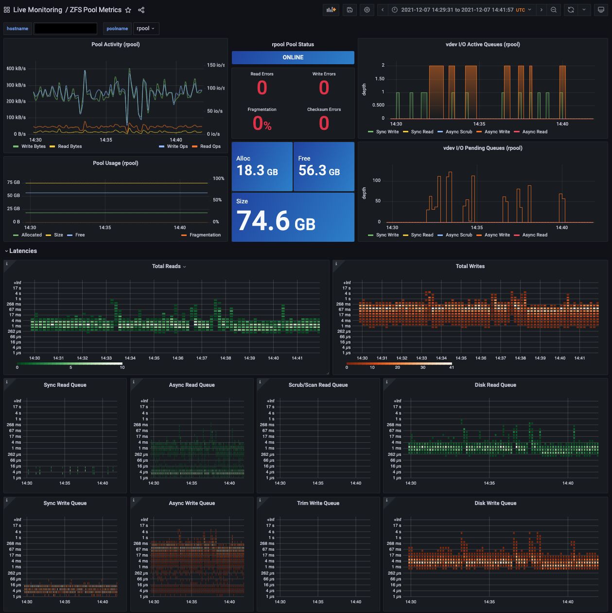
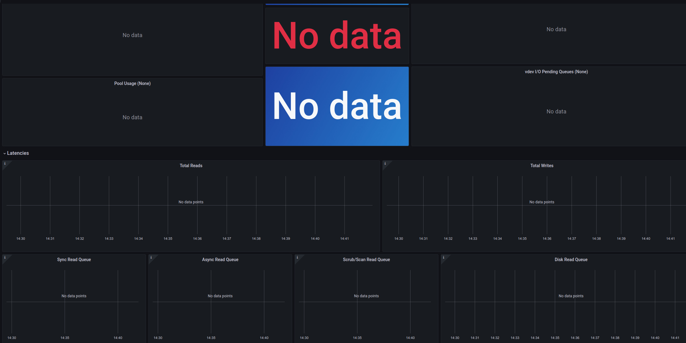
The problem for me is that I run influxdb2, but the dashboards are set up for influxdb1. As such, they don’t display anything:
So I have a couple of options:
- set up an influxdb v1 instance for this data
- port the dashboards to pull from an influxdb v2 instance
I am pretty new to grafana and know very little about it which would make the second option by far the more involved one… but it’s a good opportunity to learn and get some experience and I can’t pass that up!
Porting to InfluxDB v2: A Work in Progress
Overview
Preamble: it goes without saying that as a relative novice, what I say here should not be taken as gospel, it’s just what I have gleaned while reading up so I can port the dashboards
Being a complete novice, sometimes the trouble is in knowing where to start! It took me a while to realise the issue with the zpool_influxdb dashboards not showing any data was due to them being written for v1, with the changes to v2 breaking compatibility:
- influxdb v1 relied mostly on influxQL, a SQL-like query language. influxdb v2 instead uses flux, which is both a scripting and query language
- influxdb v1 has no concepts of organisations or buckets (so far as I can tell), so getting to the data means ensuring you have both organisation access and querying the right bucket
Those two things mean that fixing the dashboards is not going to be a simple “change one line here to point to the new data”, it’s going to be a full on port. Fortunately, we have a few things to work from:
- the json of the dashboards (Scot MacDonald’s dashboard, Richard Elling’s dashboard), which presumably have everything necessary to recreate the dashboards when using an influxdbv1 data source
- the screenshot of one of the dashboards (reproduced above), which is very useful for knowing what the panels (graphs etc) are supposed to look like
- the output of
zpool iostatto compare numbers it reports to the graphs produced
Getting Started: The Latency Histograms
I chose to start with the latency histograms as the motivation for this was to see if the latencies reported by the CLI histogram change over time. We’ll start with what the panel should roughly look like and use the json to see what it references, then write a flux query to get the data we need.

The readme for zpool_influxdb recommends using a grafana heatmap, as a ‘histogram-over-time’.
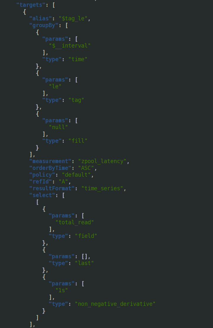
Looking at the latter half of the json, we can see it pulls from zpool_latency, and uses the total_read field. The info it is interested in are _interval and the le tag. le is often used to notate buckets — eg in Prometheus, where buckets are cumulative (ie include lower values) — ‘le’ is shorthand for ‘less than or equal to’. There is something else important in there, non_negative_derivative, which we’ll come back to later.
We can construct a basic first-try flux query from the info we have:
from(bucket: "artemis")
  |> range(start: v.timeRangeStart, stop: v.timeRangeStop)
  |> filter(fn: (r) => r["_measurement"] == "zpool_latency")
  |> filter(fn: (r) => r["vdev"] == "root")
  |> filter(fn: (r) => r["_field"] == "total_read")
which gets us a heatmap:

That is recognisably a heatmap! It looks pretty different to the other one in two key ways:
- the y axis looks terrible
- the actual visualisation of the data looks different
For the first, it seems that the query is producing output with more fields than what we’re interested in. We may be able to use drop() or keep() to get what we’re after. Trying keep() was giving me errors in both influx and grafana, so I’ll need to come back to that.
For the second, this is where the non_negative_derivative comes in. A derivative in this context looks at the change over time. The derivative of distance is velocity (rate of change in distance), and the derivative of velocity is acceleration (rate of change in velocity). Now, I can hear my high school physics teacher cringing in the distance, so I am going to leave that very simplified illustration there. The panel’s intent is to show the change in latencies over time, which is why it looks different. My heatmap doesn’t change much, so since there’s not much to show we’ll come back to using derivatives later.
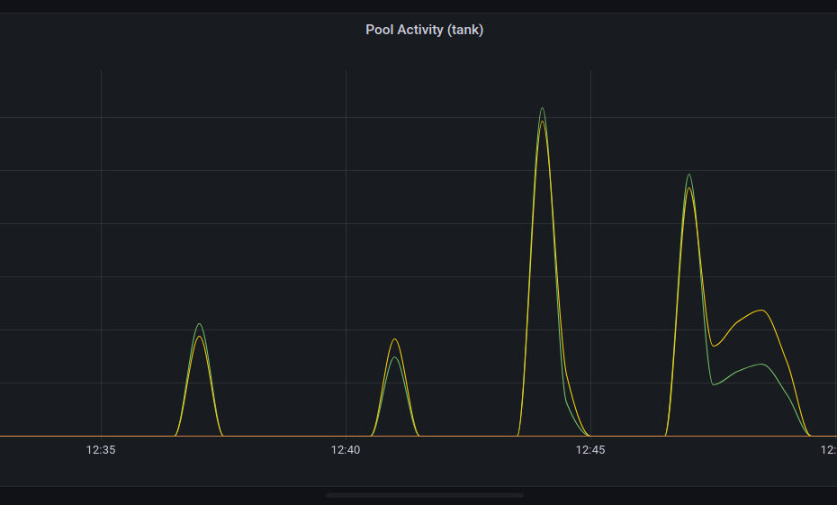
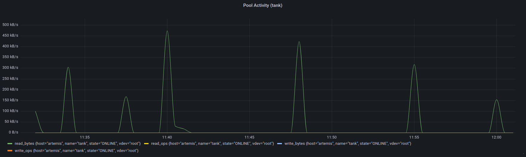
The Line Graphs: Pool Activity
Last time I teased a graph of activity:
Let’s see what we need.
"measurement": "zpool_stats",
          "orderByTime": "ASC",
          "policy": "default",
          "refId": "A",
          "resultFormat": "time_series",
          "select": [
            [
              {
                "params": [
                  "write_bytes"
                ],
                "type": "field"
              },
              {
                "params": [],
                "type": "last"
              },
              {
                "params": [
                  "1s"
                ],
                "type": "non_negative_derivative"
              },
              {
                "params": [
                  "Write Bytes"
                ],
                "type": "alias"
              }
            ],
            [
              {
                "params": [
                  "read_bytes"
                ],
                "type": "field"
              },
              {
                "params": [],
                "type": "last"
              },
              {
                "params": [
                  "1s"
                ],
                "type": "non_negative_derivative"
              },
              {
                "params": [
                  "Read Bytes"
                ],
                "type": "alias"
              }
            ],
[
              {
                "params": [
                  "write_ops"
                ],
                "type": "field"
              },
              {
                "params": [],
                "type": "last"
              },
              {
                "params": [
                  "1s"
                ],
                "type": "non_negative_derivative"
              },
              {
                "params": [
                  "Write Ops"
                ],
                "type": "alias"
              }
            ],
            [
              {
                "params": [
                  "read_ops"
                ],
                "type": "field"
              },
              {
                "params": [],
                "type": "last"
              },
              {
                "params": [
                  "1s"
                ],
                "type": "non_negative_derivative"
              },
              {
                "params": [
                  "Read Ops"
                ],
                "type": "alias"
              }
            ]
          ],
So we’re looking for four fields in zpool_stats: read_bytes, write_bytes, read_ops, write_ops, and we want the non-negative derivative of those.
from(bucket: "artemis")
  |> range(start: v.timeRangeStart, stop: v.timeRangeStop)
  |> filter(fn: (r) => r["_measurement"] == "zpool_stats")
  |> filter(fn: (r) => r["name"] == "${poolname}")
  |> filter(fn: (r) => r["host"] == "${hostname}")
  |> filter(fn: (r) => r["vdev"] == "root")
  |> filter(fn: (r) => r["_field"] == "read_bytes" or r["_field"] == "write_bytes" or r["_field"] == "read_ops" or r["_field"] == "write_ops")
  |> derivative(nonNegative: true)
We filter on ${poolname} and ${hostname} to use the variables that the dashboard has set up. We narrow to the root vdev so that we only get one set of data. We finally filter on the four fields we’re interested in, and then take the non-negative derivative to get the change in data rate/iops over time.
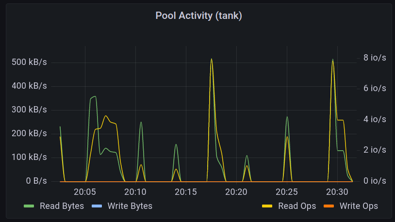
I used an image compare widget to illustrate the use of derivative.
This is looking okay, but it could look better, particularly in the legend.
We can drop what we don’t need: |> drop(columns: ["host", "name", "state", "vdev"])

Better, but we can improve on that. There is a useful GitHub comment by mdb5108 that illustrates using map() to change the columns. We can transform the fields using a combination of replaceAll() and title():
import "strings"

KEEPCOLS = ["_field", "_time", "_value"]

niceify_legend = (leg) => strings.title(v: strings.replaceAll(v:leg, t: "_", u: " "))

RawData = from(bucket: "artemis")
  |> range(start: v.timeRangeStart, stop: v.timeRangeStop)
  |> filter(fn: (r) => r["_measurement"] == "zpool_stats")
  |> filter(fn: (r) => r["name"] == "${poolname}")
  |> filter(fn: (r) => r["host"] == "${hostname}")
  |> filter(fn: (r) => r["vdev"] == "root")
  |> filter(fn: (r) => r["_field"] == "read_bytes" or r["_field"] == "write_bytes" or r["_field"] == "read_ops" or r["_field"] == "write_ops")
  |> derivative(nonNegative: true)

  NamedData = RawData
    |> map(fn: (r) => ({_value:r._value, _time:r._time, _field:niceify_legend(leg: r["_field"])}))
    |> keep(columns: KEEPCOLS)
    |> yield()
We defined a function, niceify_legend(), which splits the legend on an underscore and title-cases it. We then passed the raw data though a mapping to ‘niceify’ _field using that function. The result:
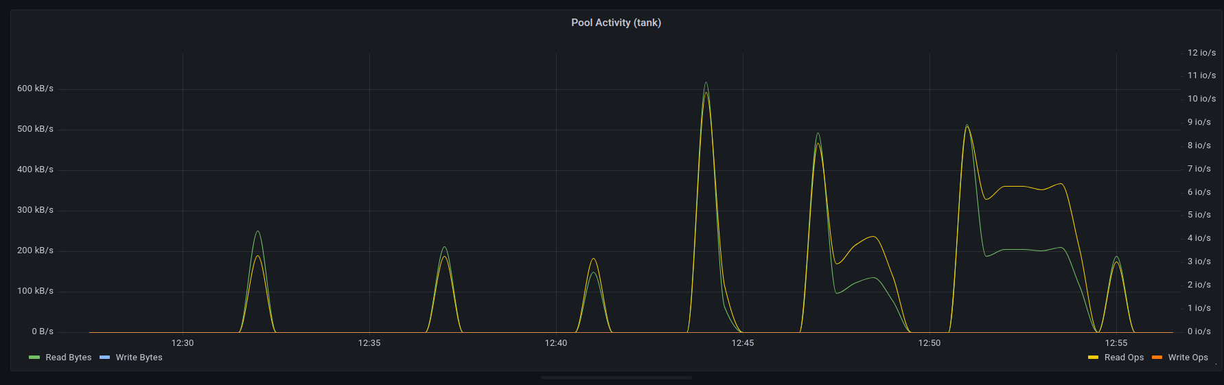
The legend looks great, and you’ll notice part of it has shifted to the right. That’s already set up in the panel’s json, which we can see via GUI in grafana:
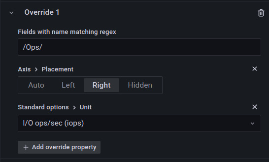
This adds a second axis for the iops data.
We can repeat this process for the other top four time series panels, but as my pool is pretty static at the moment, there’s not much to show.
More to follow- fixing up heatmaps, status panels and more!
Hi Rob
I am struggleing as well with the porting of the reads and writes heatmap. I am done with most other things. If you want we can share our changes.
Hi Berick, thanks for taking the time to comment. To be honest, it took me a bit of time to wrap my head around! I finished porting the dashboard eventually- the JSON can be downloaded from Part 5 of this post series (https://blog.roberthallam.org/2022/09/monitoring-zfs-with-influxdb-grafana-publishing-and-reflection-part-5/); I’m going to push it out to Grafana.com too now that one of the site’s folks replied to me on Twitter.
Hopefully that covers any areas you might still need, but I’m all ears for potential improvements! 🙂
Hey Rob
Thanks for that. I was going nuts on the heatmaps. Now I will wait for some time to see how the data looks like as my server is quite idle most of the times 😉
Cheers!
My pleasure!
I had to do some simulated activity (copying some files, dd, etc) to make the graphs show something for the screenshots >_< Your comment prompted me to actually publish the dashboard, but the link 404s for me: https://grafana.com/grafana/dashboards/17350 �\_(?)_/�